About
As an aspiring data analyst, I bridge the gap between raw information and human understanding. What started with structuring data pipelines in Excel and Power Query has grown into a practice of crafting interactive visualizations using Python, QGIS, and Flourish—each project an opportunity to reveal the narratives hidden within datasets.I'm drawn to the messy, the complex, the overlooked. Whether mapping global migration patterns or uncovering cultural heritage through numbers, I believe every dataset holds a human story waiting to be told. My approach combines analytical precision with thoughtful design, creating dashboards and visuals that don't just present information—they invite exploration and spark insight.Currently, I'm seeking opportunities where I can apply my skills in data management and visualization to create meaningful impact. Let's connect—explore my projects below or reach out via [Contact/LinkedIn].
Core Data Projects
| DIABETES RISK CALCULATOR |
|---|
| EXCEL | VBA | PIVOT TABLES | CHARTS | CORRELATION ANALYSIS |
| - Created a VBA-powered Excel tool to calculate diabetes risk based on user input. - Designed a dynamic dashboard analyzing 250K+ records of health data, revealing key risk factors and preventive trends. |
| SMARTPHONE MARKET DATA ANALYSIS & VISUALISATION |
|---|
| EXCEL | POWER QUERY | PIVOT TABLES | CHARTS | |
| - Collected and analyzed real smartphone data from 14 UK retailers to explore pricing trends, consumer engagement, and brand performance. - Designed a comparative dashboard showing best-value models and stock availability. |
| AMAZON FASHION SALES |
|---|
| EXCEL | PIVOT TABLES | CHARTS |
| - Built an interactive Excel dashboard to analyse Amazon Fashion sales. - Automated reports that track revenue by category, seasonality, and customer trends across multiple fashion segments and time periods. |
| JOB BOARD SCRAPER - AUTOMATED DATA EXTRACTION VIA POWER QUERY |
|---|
| EXCEL | POWER QUERY | PIVOT TABLES | CHARTS | DATA CLEANING |
| - Created an automated Excel dashboard that scrapes and updates job listings directly using Power Query. - Cleaned, structured, and visualized key job market insights including salary ranges, company distribution, and posting trends |
| DIABETES RISK CALCULATOR |
|---|
| Excel (VBA, Descriptive Statistics, Correlation Analysis) | Health Analytics Simulation |
Developed a comprehensive health analytics simulation combining VBA automation, descriptive statistics, and correlation modeling to explore the behavioral and clinical factors influencing diabetes risk
In this project I simulated an end-to-end public health analytics workflow, integrating data entry, statistical analysis, and visualization using a dataset of over 250,000 anonymized health records.It features automated VBA forms for streamlined patient data input and personalized risk calculations, alongside PivotTable dashboards that visualize behavioral and lifestyle risk patterns.Correlation and regression analyses quantify the impact of BMI, mental health, and physical health on diabetes outcomes.The system culminates in automated PDF report generation, simulating professional healthcare reporting.
The goal was to simulate a complete health analytics workflow — from raw patient data to diagnostic dashboards and statistical modeling — using Excel as a single, unified analysis environment.
Business Questions Answered:
Which health and lifestyle factors most strongly predict diabetes?
How do BMI, mental health, and physical health interact with diabetes risk?
What are the behavioral differences (smoking, alcohol, physical activity) between diabetic and non-diabetic groups?
Which demographic groups show the highest diabetes prevalence?
How do comorbidities (hypertension, obesity, heart disease) cluster among diabetic patients?
Data Structure:
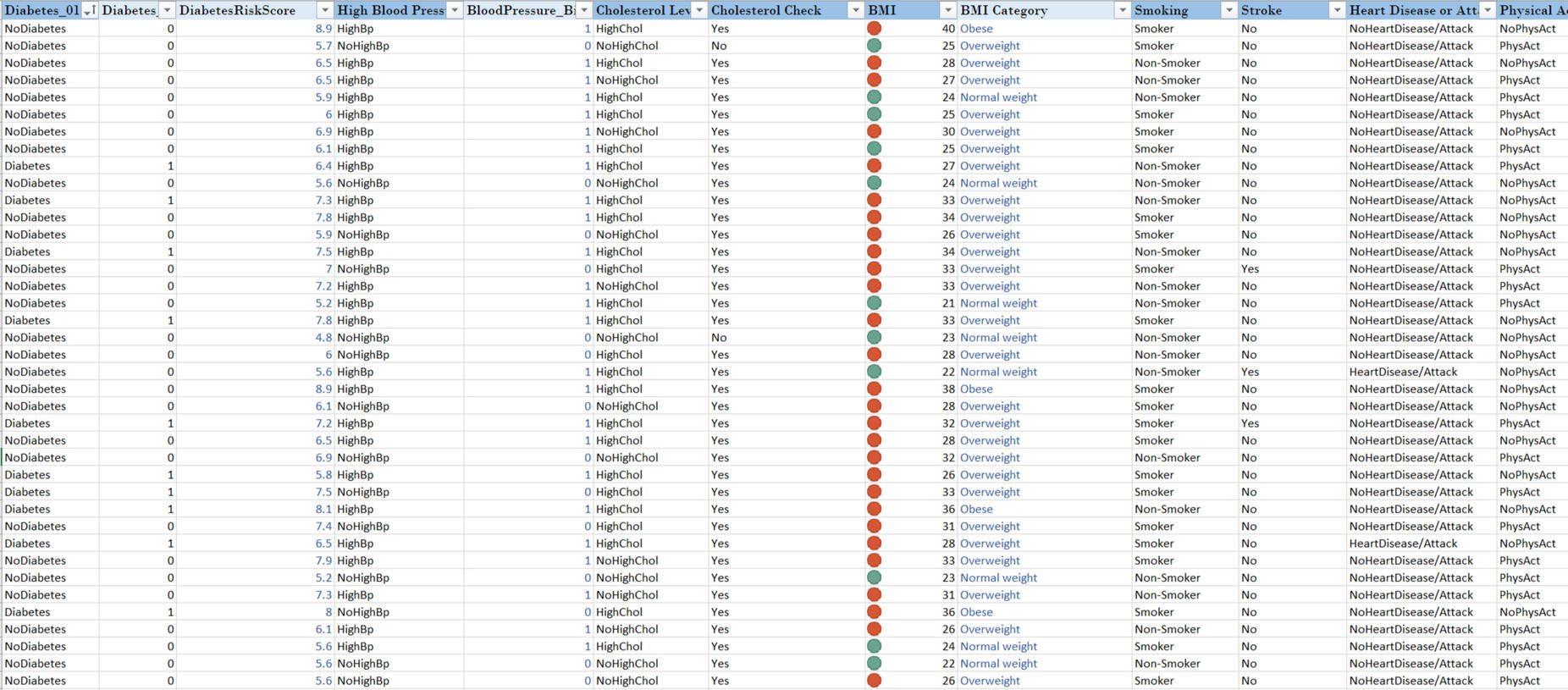
The dataset contained 16 key health and lifestyle indicators, including:Diabetes, Diabetes Risk Score, Cholesterol Levels, BMI, Smoking (Yes/No), Stroke (Yes/No), Heart Disease, Physical Activity (Yes/No), Fruits (Yes/No), Veggies (Yes/No), Alcohol Consumption (Heavy/Not Heavy), General Health, Mental Health, Physical Health, Difficulty Walking, Sex, and Age.
Analytical Components
PivotTables & Dashboards
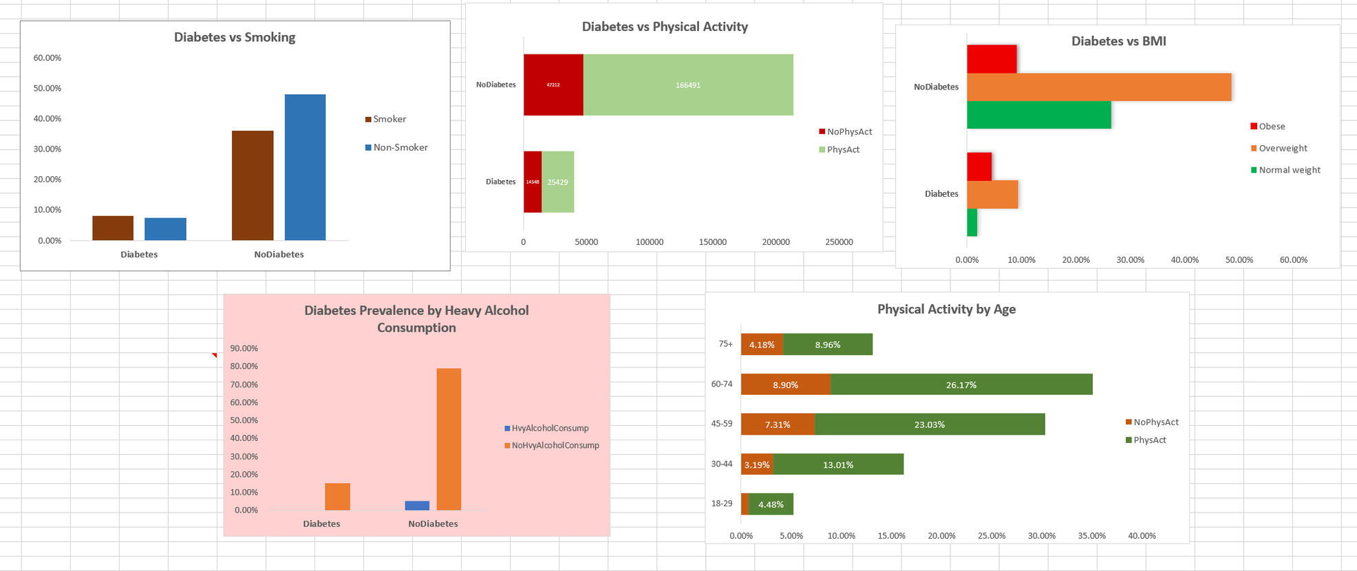
Five analytical dashboards were created, each powered by dedicated PivotTables:
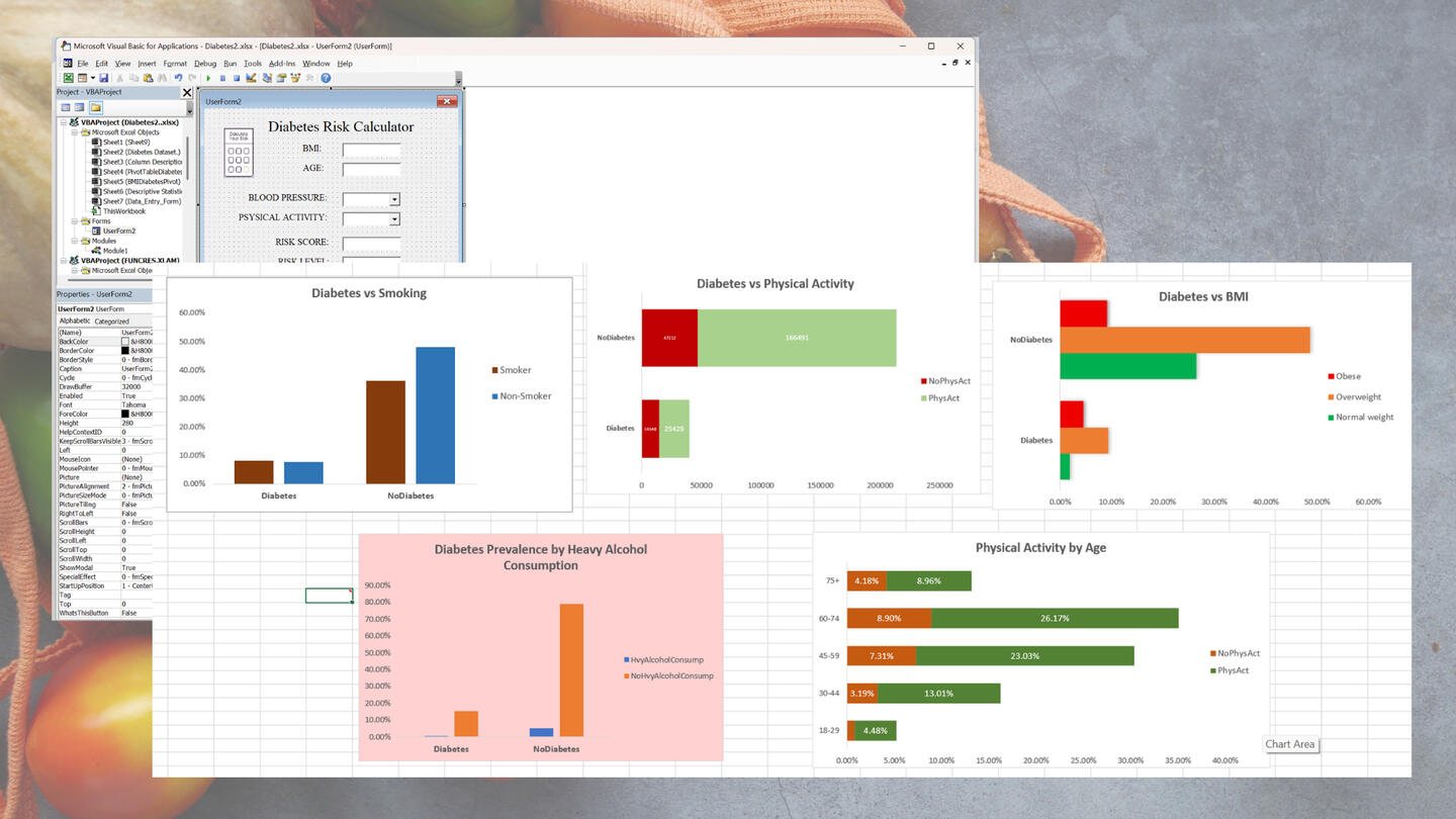
Smoking vs Diabetes – Compares prevalence between smokers (18.3%) and non-smokers (13.7%).
Physical Activity vs Diabetes – Highlights lower diabetes prevalence among physically active individuals (13.3%) compared to inactive (23.6%).
Alcohol Consumption vs Diabetes – Reveals a counterintuitive pattern: lower diabetes rates among heavy drinkers (7.3%) than non-heavy drinkers (16.3%), likely due to age or reporting biases.
BMI vs Diabetes – Shows obesity as the strongest predictor: obese (33%), overweight (16.2%), normal weight (6.7%).
Age vs Physical Activity – Indicates older adults (60–74) are more physically active, while younger adults (18–29) show lower activity rates.
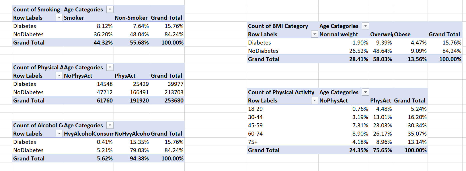
Each dashboard was visualized using bar and donut charts, supported by conditional formatting for risk highlighting.
Exploratory Data Analysis
Decriptive Statistics
I studied BMI, mental health, and physical health in a dataset of 253,679 people:
BMI: The average BMI is 28.38, meaning most people are overweight. Some have much higher BMIs, making the data lopsided (skewness ≈ 2.12).
Mental Health: People feel mentally unwell for about 3.18 days a month, with a few feeling bad much more.
Physical Health: On average, people feel physically unwell for 4.24 days a month, with some reporting many more bad days.
Regression Statistics
The model shows a moderate connection between these factors and diabetes risk, explaining a small but meaningful portion of why risk varies. With so many records, the results are reliable.The model confirms that BMI, mental health, and physical health play a role in diabetes risk, though other factors also matter.
Each Factor:
BMI: Higher weight strongly increases diabetes risk.
Mental Health: Feeling mentally unwell for more days slightly raises risk.
Physical Health: More days of poor physical health also increases risk, but less than BMI.

What It Means: Most people are overweight, and some have notable mental or physical health issues, which could increase diabetes risk, especially for those with higher BMIs.
Being overweight is the biggest factor driving diabetes risk. Poor mental and physical health add smaller risks. This supports focusing on weight management and overall health to lower diabetes chances.
Correlation Matrix
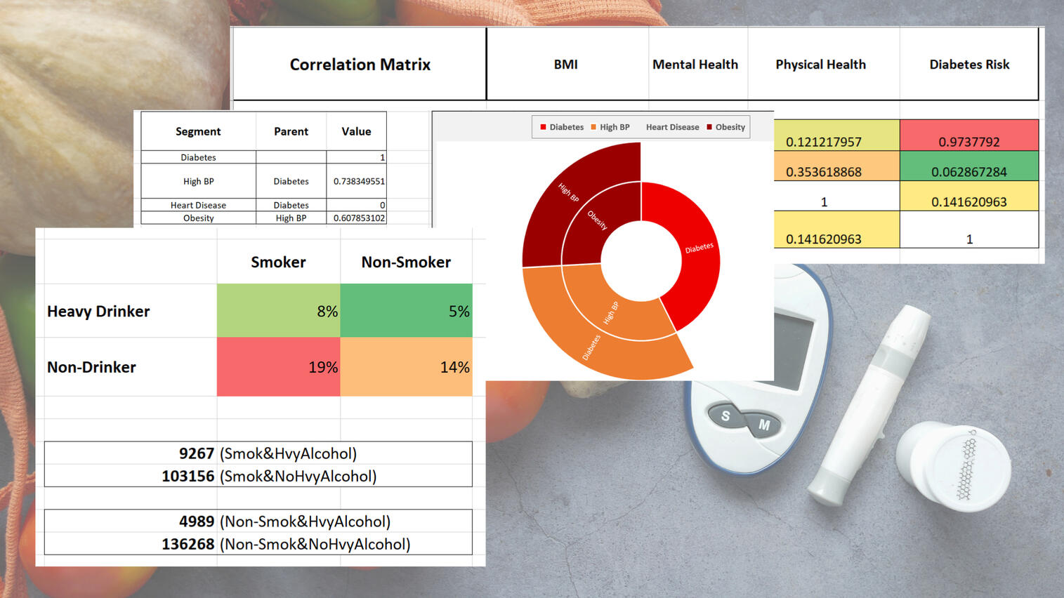
A correlation matrix was developed to explore the relationships among BMI, Mental Health, Physical Health, and Diabetes Risk.
Key Insights:BMI shows an almost perfect correlation with diabetes risk, confirming it as the primary clinical predictor.
Mental and physical health factors exert smaller yet significant effects — highlighting that while diabetes is largely metabolic, behavioral and psychological dimensions contribute modestly to overall risk.

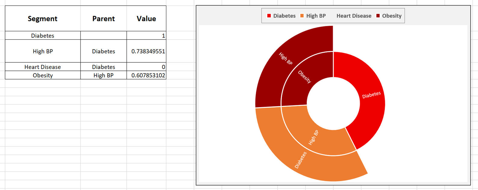
Comorbidity Analysis
Assessed the overlap of diabetes with major conditions:
74% of diabetics also have high blood pressure.
61% of diabetics with hypertension are obese (BMI ≥ 30).
0% with heart disease (likely missing or miscoded).
Insight: Diabetes, hypertension, and obesity often co-occur — forming a chronic disease triad that requires integrated intervention.
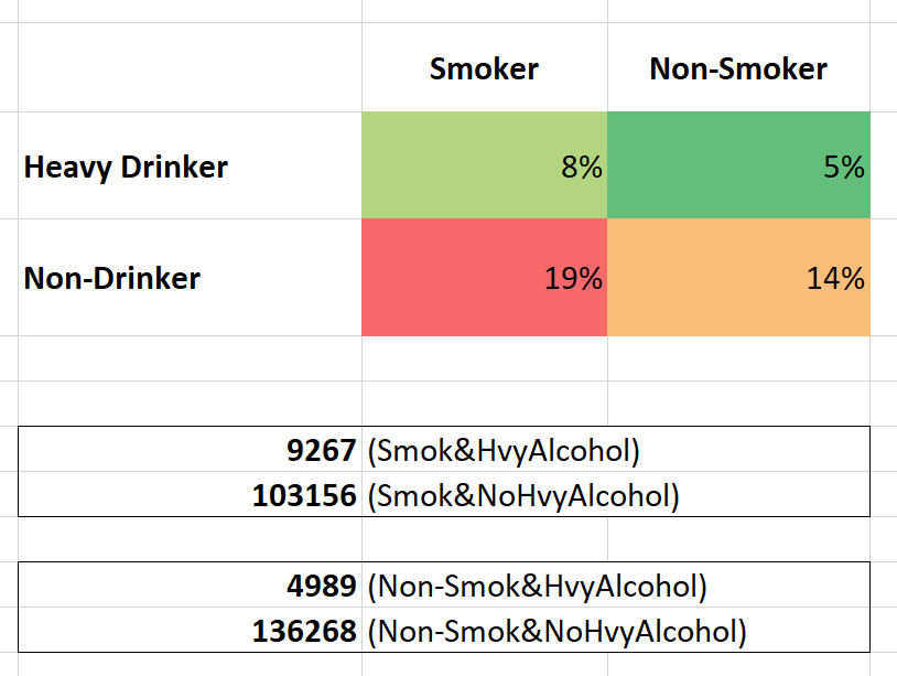
Behavioral Risk Heatmap
Assessed the overlap of diabetes with major conditions:
Highest diabetes risk: Smokers who are non-drinkers (19% prevalence).
Lowest risk: Non-smokers who are heavy drinkers (5% prevalence).
Insight: Smoking remains the stronger predictor of diabetes.
The lower prevalence among heavy drinkers likely reflects demographic skew or data artifacts, not causation.
Key Insights
BMI as the Dominant Driver:
BMI shows an almost perfect positive correlation (r = 0.974) with diabetes risk.
Weight management should be the top priority in prevention programs.Mental & Physical Health Effects:
Both show statistically significant but modest effects on diabetes likelihood.
Poorer mental or physical health slightly raises risk, confirming multidimensional impacts.Lifestyle Factors:
- Physical activity reduces diabetes prevalence by ~10%.
- Smokers have ~33% higher diabetes rates than non-smokers.
- Heavy drinking correlates with lower prevalence — interpreted cautiously due to possible biases.Comorbidity Clusters:
Most diabetics also suffer from hypertension and obesity, emphasizing integrated chronic disease strategies.Demographic Patterns:
Older adults remain more physically active, while younger adults report less — highlighting a behavioral intervention opportunity.
Conclusion
The analysis highlights BMI as the dominant predictor of diabetes risk (r = 0.974), showing a strong, near-linear link where higher body mass significantly raises the likelihood of developing diabetes. This underscores weight management as the most essential preventive strategy.
In addition, physical and mental health play smaller but significant roles, with more days of poor physical health and even slight mental health declines linked to elevated risk. These findings reveal diabetes as a multifaceted condition influenced not just by metabolic factors like BMI, but also by lifestyle behaviors, activity levels, stress, and emotional well-being.
| SMARTPHONE MARKET DATA ANALYSIS |
|---|
| Excel | Market Research |
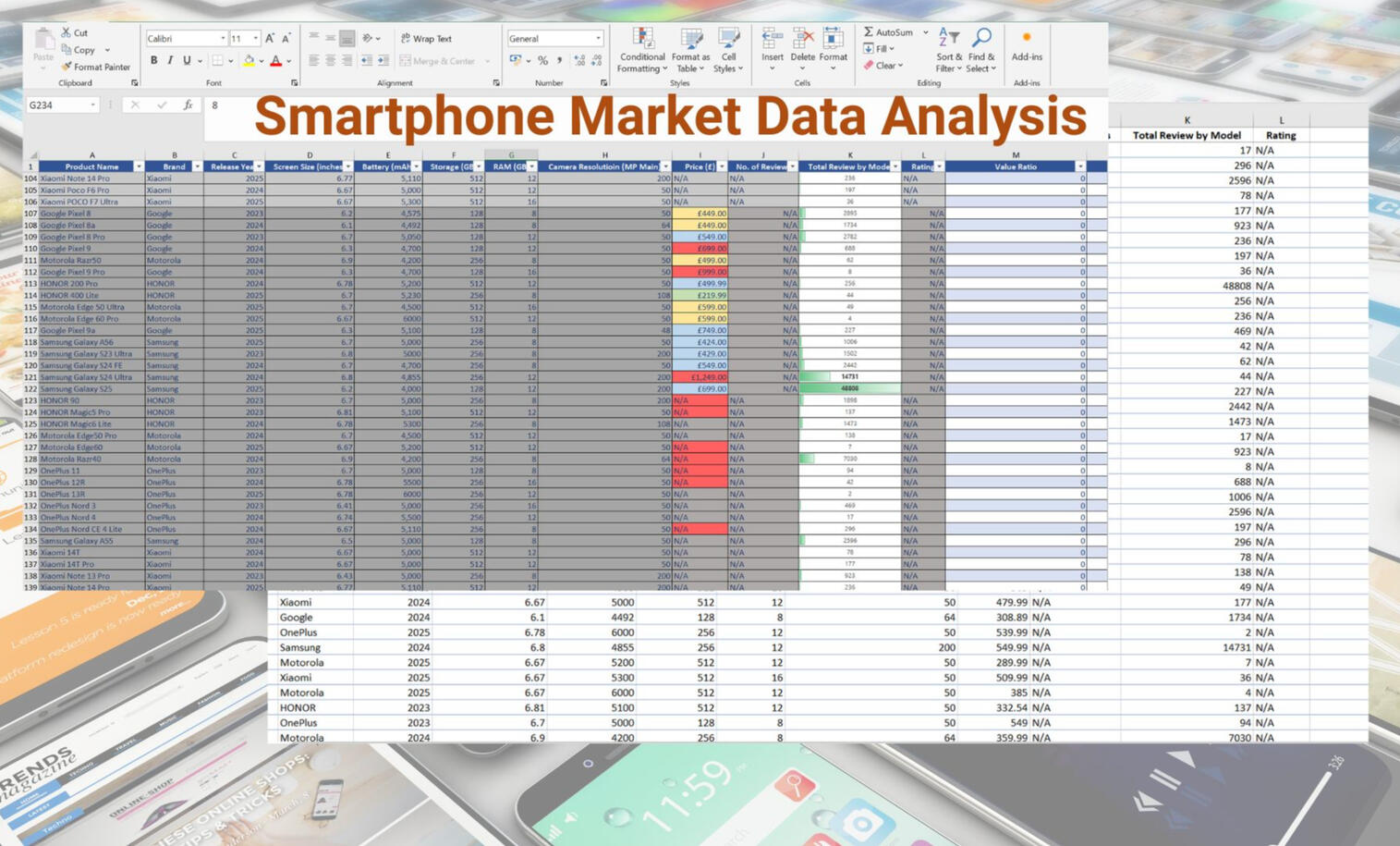
*Developed a comprehensive analytics simulation using a manually curated dataset, gathered from official UK retailer and brand websites
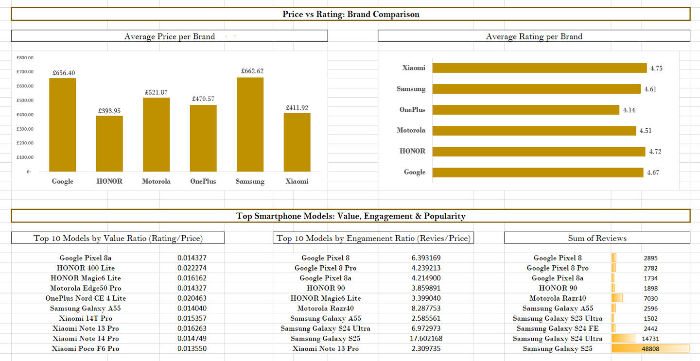
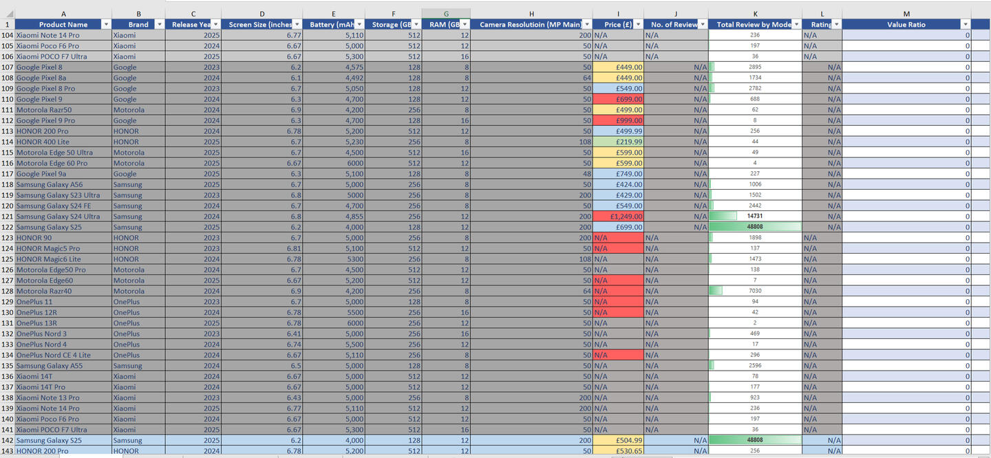
This project utilizes a manually curated dataset collected from 14 official UK retailer and brand store websites for 35 different smartphone models across six major brands: Google, Honor, Motorola, Samsung, Xiaomi, and OnePlus.I manually gathered all data (prices, ratings, reviews, and availability) directly from each site and thoroughly cleaned the data in Excel by standardizing formats, correcting model names, and removing duplicates to ensure integrity. I then created specialized calculated fields, including a Value Ratio (Rating / Price) and an Engagement Ratio (Reviews / Price), to enable advanced comparative analysis.
The goal was to simulate a complete data workflow — from manual data collection to a dynamic Excel dashboard — demonstrating how real-world market insights can be derived.
Business Questions Answered:
Which smartphone brands offer the best value for money?
How do price and rating correlate across different models?
Which retailers maintain the best stock availability?
Which models attract the highest customer engagement and reviews?
Data Preparation:
For this project, I manually gathered data from 14 official UK retailers and brand stores. The data was thoroughly cleaned in Excel by standardizing price formats, correcting brand and model names, and removing duplicates to ensure integrity.I then created specialized calculated fields, including a Value Ratio (Rating / Price) and an Engagement Ratio (Reviews / Price), and verified all source links and retailer entries for consistency and completeness.
Pivot Tables
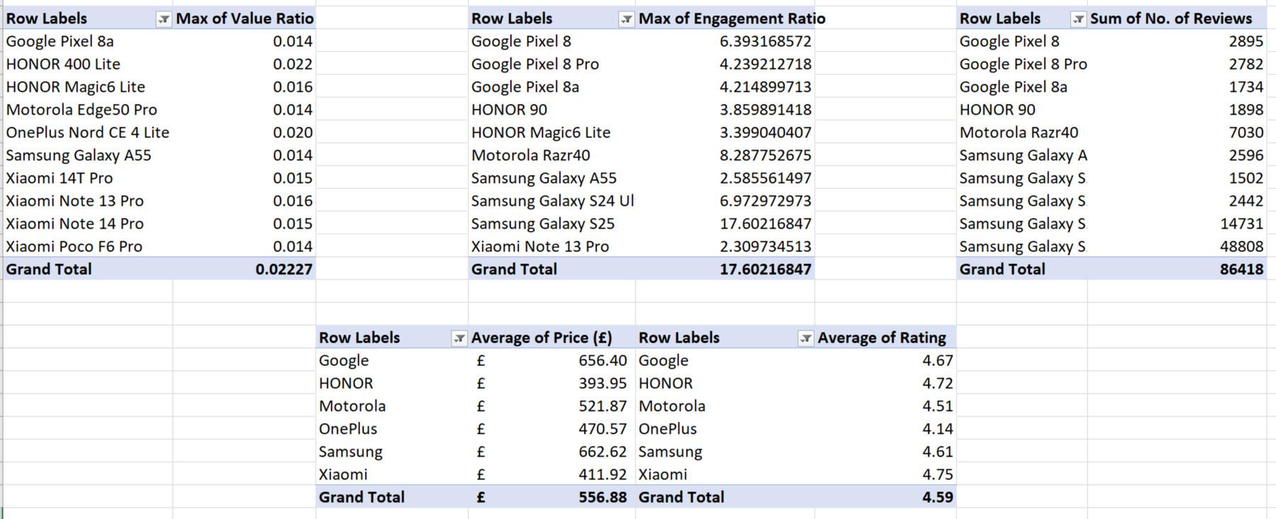
I generated ten core PivotTables to structure the comparative analysis of the smartphone data.
Top 10 Smartphones by Max Value Ratio
Top 10 Smartphones by Max Engagement Ratio
Total Number of Reviews per Model
Average Price & Rating per Brand
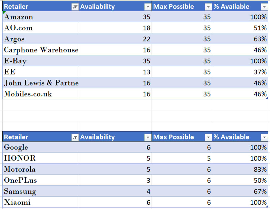
Retailer Stock Availability
Top 10 Models by Value Ratio (Rating/Price)
Top 10 Models by Engagement Ratio (Reviews/Price)
Top 10 Models by Total Reviews (Popularity)
The PivotTables established the foundation of the analysis by aggregating and segmenting the data, allowing for direct comparison of metrics.

Dashboards & Visualization
The analysis was presented through four dashboards created for clear comparative analysis. Key visualizations included:
Average Price per Brand
Average Rating Per Brand
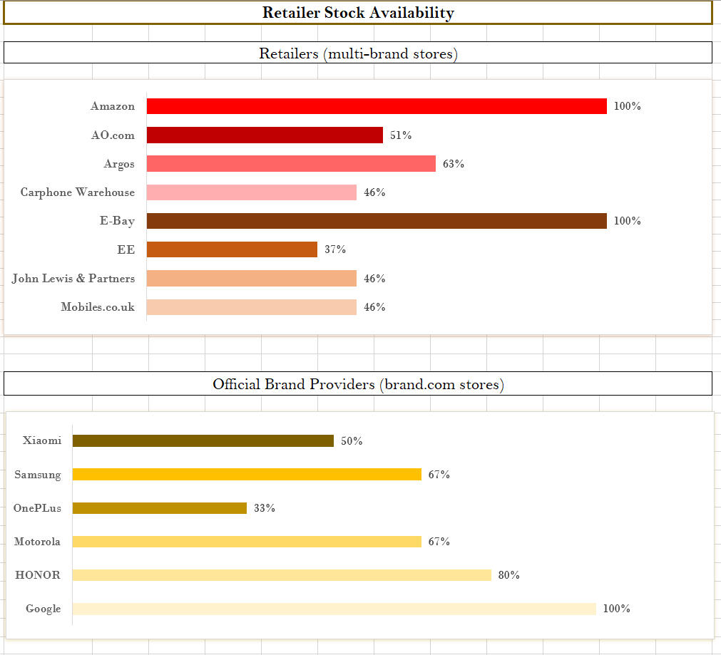
Retailer Stock Availability for Multibrand Stores
Retailer Stock Availability for Official Brand Stores.

Key Insights
Value vs. Price: Budget smartphones often outperform premium models in terms of value ratio, offering higher satisfaction per pound spent.
Engagement: Cheaper models receive stronger engagement ratios, suggesting that affordable smartphones attract more consumer interaction.
Retailer Performance: Multibrand stores (Amazon, eBay, Argos) maintain more complete stock listings than brand-exclusive stores.
Brand Trends: Brands like Honor and OnePlus consistently deliver competitive value, balancing features and cost effectively.
Market Gaps: Premium flagships show lower engagement relative to their higher prices, indicating diminishing consumer enthusiasm at the high end.
Conclusion
This project demonstrates how manual research and Excel-based analysis can generate meaningful insights into competitive markets.
By combining self-collected data with structured PivotTables and dashboards, the analysis highlights real-world consumer and pricing trends
| AMAZON E-COMMERCE PROJECT |
|---|
| EXCEL (Pivot Tables & Charts) |
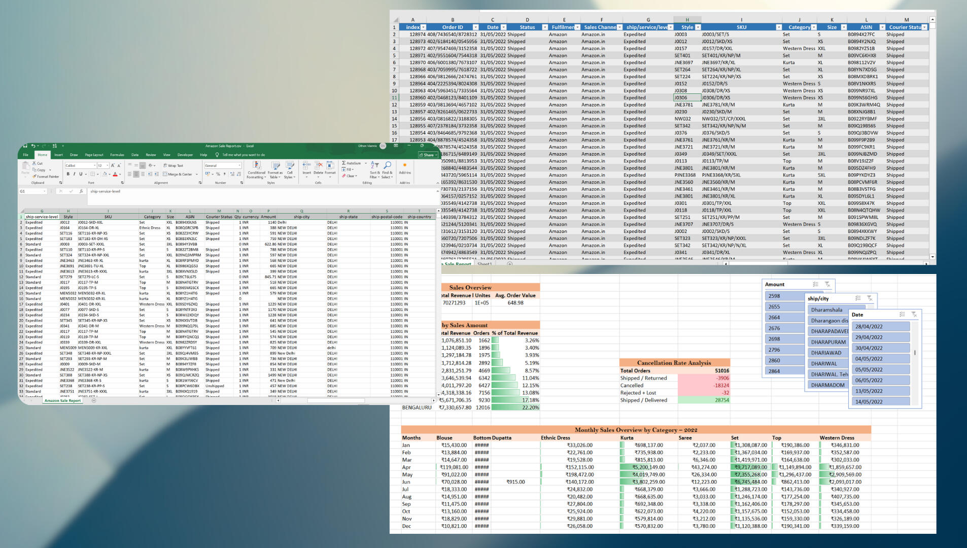
Made for an internal e-commerce analytics simulation. Recreated with anonymized Amazon Fashion sales metrics.
Developed a structured Excel workflow and dashboard to consolidate and analyze over 128,000 rows of monthly Amazon Fashion sales across multiple product categories and seasons. Replaced manual reporting with automated formulas and PivotTables, enabling refreshable insights into revenue, returns, and customer trends over a 12-month period.
The goal was to simulate an end-to-end workflow — from raw e-commerce data to business-ready visual insights.
Business Questions Answered:
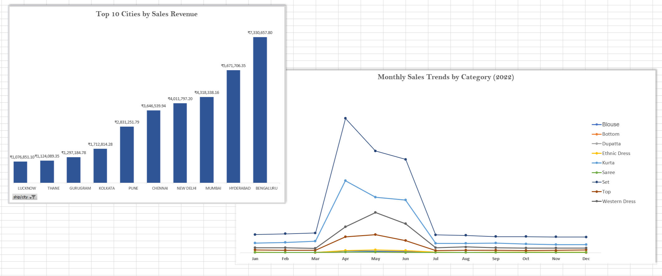
Which cities generate the highest fashion sales revenue?
What are the monthly sales trends throughout 2022?
How frequently do order cancellations occur compared to completed sales?
Which product categories perform best by revenue and season?
Data Processing Steps:
Firtly, I imported a 2022 CSV Amazon Fashion dataset from Kaggle containing 128,974 rows of transaction records.Then, I cleaned and standardized data fields by removing duplicates, handling null values, and standardizing columns for date, category, and currency.
This analytics project involved comprehensive data visualization and summarization using PivotTables and PivotCharts.
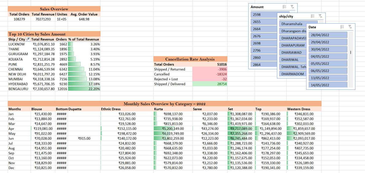
The pivot tables cover:
Sales Overview (total sales, orders, units, revenue),
Top 10 Cities by Revenue,
Cancellation Rate Analysis,
Monthly Sales Overview (2022)
The analysis provided deep-dive metrics on revenue/return rates per category and average customer value, featuring slicers for filtering and conditional formatting to highlight performance peaks.
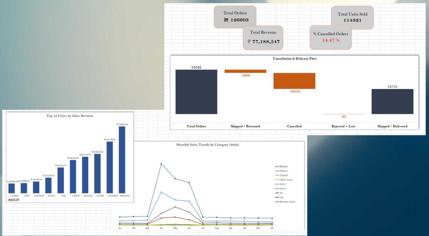
Additionally, I built three PivotCharts to visualize trends and performance:
Cancellation and Delivery Flow – total orders, cancelled orders, total units sold, and total revenue.
Top 10 Cities by Sales Revenue – bar chart showing leading markets.
Monthly Sales Trends by Category (2022) – line chart for category-level analysis.
Key Insights
Sales Peaks: Strongest revenue periods occurred in April, May and June, reflecting seasonal demand.
Top Markets: The highest-performing cities (Bengaluru, Hyderabad, Mumbai) generated a significant share of total revenue.
Cancellations: Cancellation rates showed clear variation across months, influencing total revenue trends.
Category Trends: Certain fashion categories (Kurta, Set, Top, Western Dress) showed recurring seasonal boosts.
Conclusion
This project demonstrates practical Excel data analysis skills applied to large-scale e-commerce data.
By transforming raw sales data into a visually clear dashboard, it simplifies performance monitoring and supports better business decisions.
| JOB LISTINGS SCRAPER |
|---|
| EXCEL (Power Query & Data Transformation) |
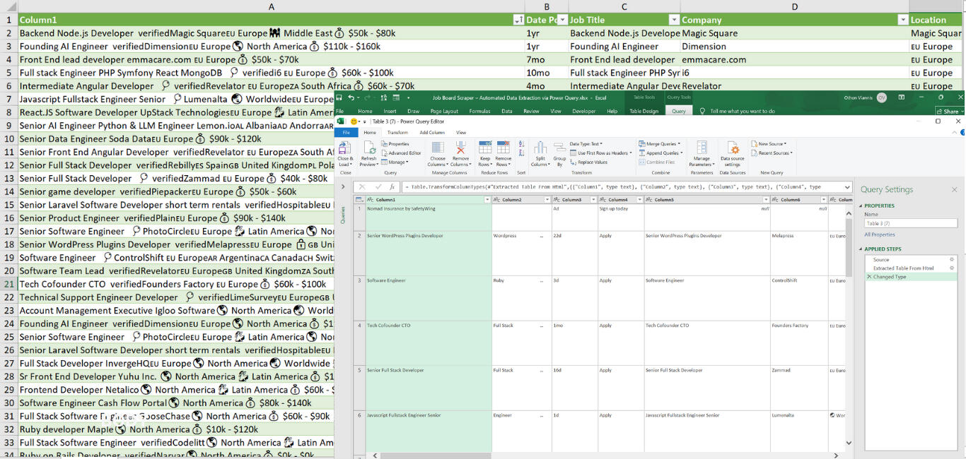
Developed as a web data automation project demonstrating Excel’s advanced Power Query and formula-based transformation capabilities.
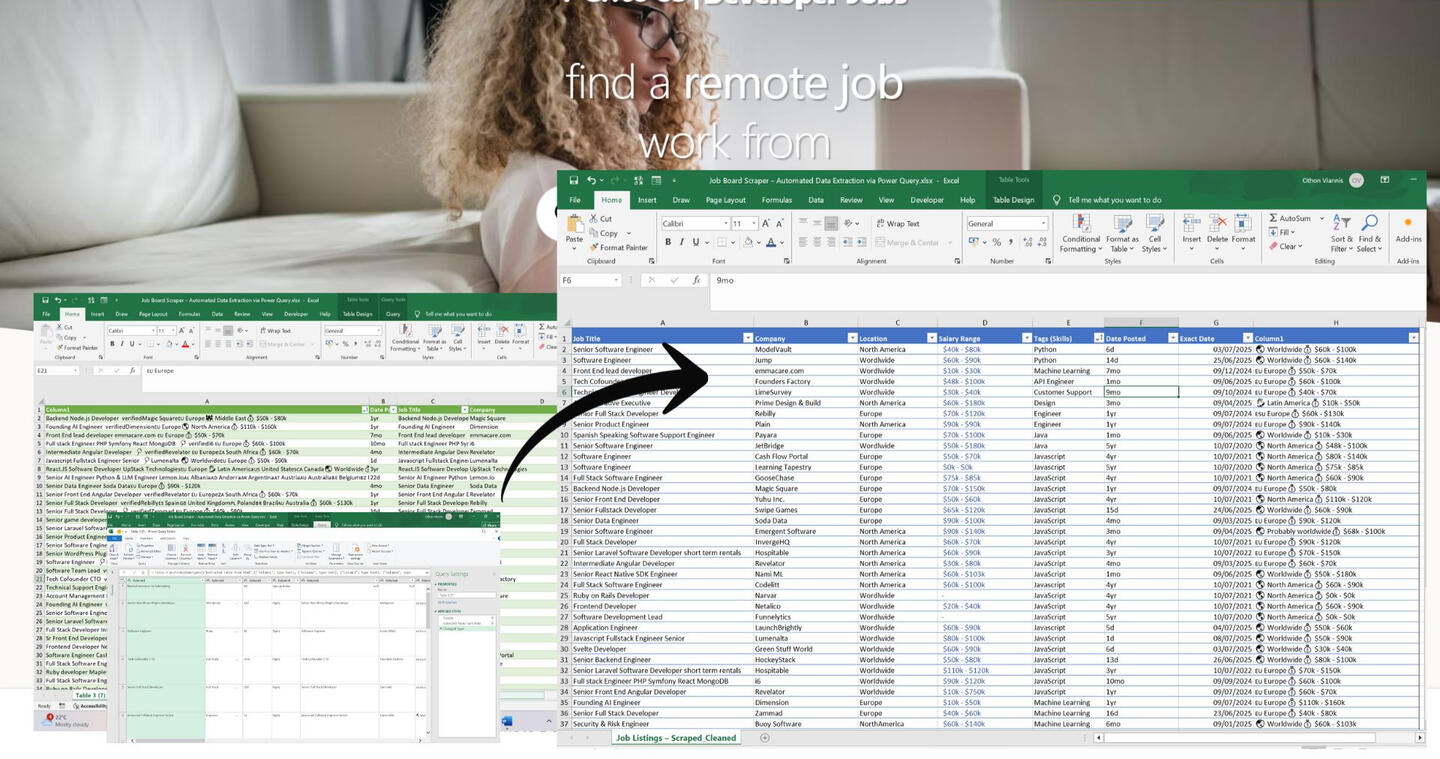
In this project I built a fully automated Excel workflow that extracts live job listings from RemoteOK, cleans messy web data, and structures it into an analysis-ready table. The project demonstrates an end-to-end workflow — from live web import to column extraction and cleaning — .
The goal was to show how Excel can act as a no-code web scraping and data transformation tool for real-world applications, such as job market research and remote work listings.
Business Questions Answered:
How can Power Query extract structured job data directly from a website?
What challenges arise when cleaning web-scraped text and HTML data?
How can Excel formulas refine and separate complex combined text (e.g., salary and date)?
Can Power Query and Excel serve as a lightweight, refreshable data scraping solution?
Data Processing Steps:
Data Extraction (Power Query – From Web)
Connected to RemoteOK using Excel’s Data → Get Data → From Web feature.
Navigated HTML tables and selected the relevant data source containing job listings.
Removed extra elements (images, logos, and HTML tags) to retain only textual content.
Data Transformation (Power Query)
Split merged text into structured fields and renamed them for clarity.
Final structured columns included:Job Title, Company, Location, Salary Range, Tags (Skills), Date Posted, Exact Date, and an auxiliary field (Column2) preserving the original combined text (e.g., 🌏 Worldwide 💰 $60k–$100k).
Trimmed whitespace, removed symbols, and standardized date and text formatting.
Data Enhancement (Excel Formulas)
Used Excel functions to extract and refine key information from the combined “Column2” field:
Salary Extraction Formula:
=MID('Job Listings – ScrapedCleaned'!$H35,FIND("💰",'Job Listings – ScrapedCleaned'!$H35)+2,LEN('Job Listings – Scraped_Cleaned'!$H35))' (Extracts salary details (e.g., “$60k - $100k”) from combined job info text.)
Exact Date Calculation Formula:
=IF(RIGHT(F55,2)="yr",TODAY()-(VALUE(LEFT(F55,LEN(F55)-2))*365),IF(RIGHT(F55,2)="mo",EDATE(TODAY(),-VALUE(LEFT(F55,LEN(F55)-2))),TODAY()-VALUE(LEFT(F55,LEN(F55)-1))))
(Converts relative posting dates (e.g., “3d ago”, “2mo ago”) into exact calendar dates.)
Techniques Used:
Power Query (ETL Workflow):
From Web connection and HTML parsing
Table selection and transformation
Column splitting and renaming
Data type conversion and trimming
Excel Functions:
MID, FIND, LEN, LEFT, RIGHT, VALUE, IF, TODAY, and EDATE for text and date extraction
Table formatting for structured display
Key Insights
Practical Automation: Power Query successfully scraped and structured 25 job listings, transforming messy web data into usable tabular form.
Data Cleaning Complexity: HTML data from job boards often includes emojis and merged symbols (🌍, 💰), requiring text parsing and manual formula logic for precision.
Formula Integration: Combining Power Query automation with Excel formulas enables precise text extraction and date calculation without coding.
Reusability: The same Power Query process can be repurposed for other job boards or online data sources with minimal modification.
Conclusion
This project demonstrates how Excel can serve as a lightweight data scraping and cleaning platform without any external scripts or APIs.By integrating Power Query for data import and Excel formulas for text parsing and enhancement, the workflow converts raw, unstructured web content into a clean, ready-to-analyze dataset.The result is a practical example of no-code web data automation, bridging everyday spreadsheet use with data analytics functionality.
Applied Data Storytelling
| Literary Text Analysis |
|---|
| Python | Excel | DaVinci Resolve | QGIS |
This project explores the transformation of August Strindberg’s writing from naturalism to expressionism through digital text analysis. Using Python for topic modeling, sentiment analysis, and named entity recognition, it reveals how psychological turmoil and social change shaped his plays. Visualized through QGIS and DaVinci Resolve, the project bridges literature, data, and storytelling.

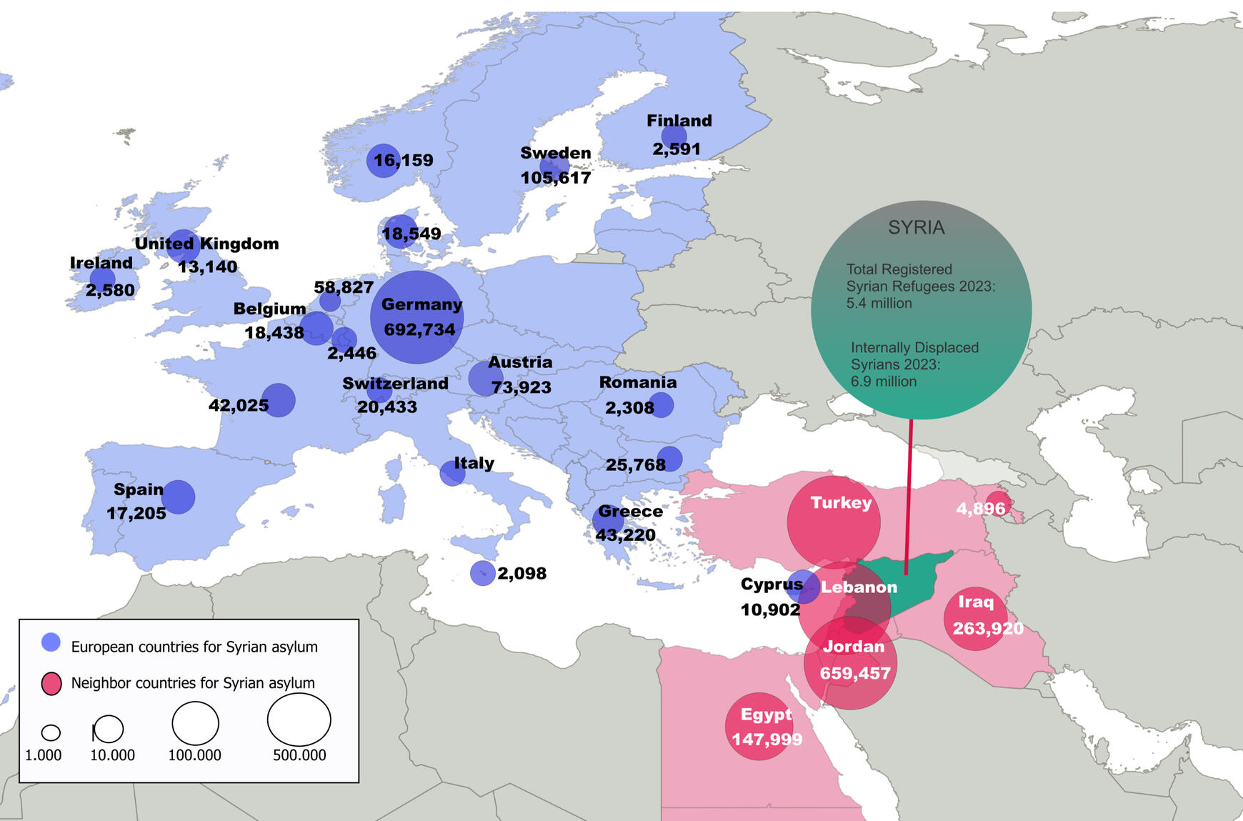
| Syrian Refugee Crisis |
|---|
| QGIS | Flourish | Excel | |
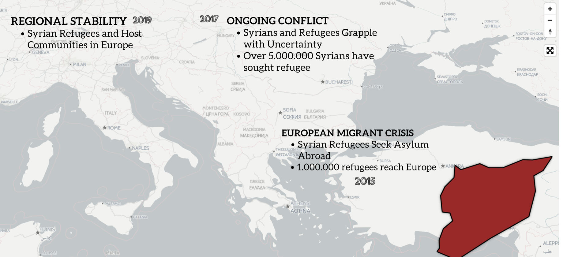
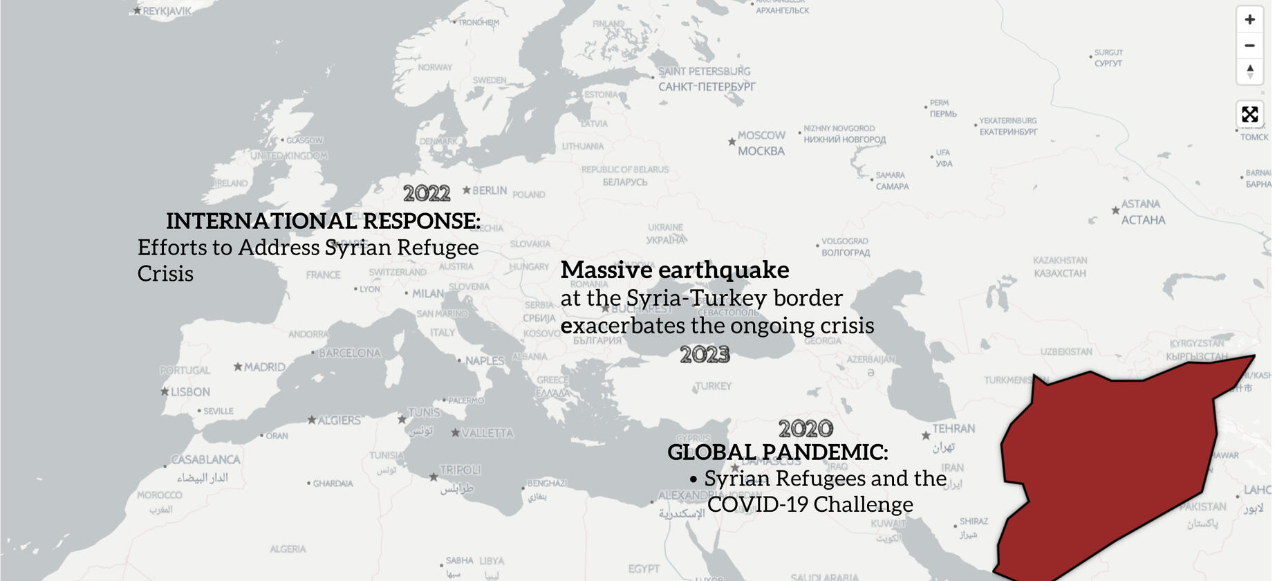
This project visualizes the human and geographic dimensions of the Syrian refugee crisis (2011–2023), using QGIS for spatial mapping and Flourish for interactive data storytelling. Drawing from UNHCR and humanitarian datasets, it traces migration routes, host countries, demographics, and humanitarian efforts.Through maps, timelines, and visual narratives, the project transforms statistics into human stories — illustrating the immense scale of displacement, the geography of refuge, and the resilience of those affected.
| Literary Text Analysis |
|---|
| Mapping Strindberg: Data, Drama, and the Human Psyche |
This project explores the evolution of Swedish playwright August Strindberg's works from naturalism to expressionism, using digital humanities tools to uncover psychological and sociocultural patterns in 29 plays.By analyzing a corpus of naturalistic (realistic, social-focused) and expressionist (symbolic, emotional) plays, I examined how Strindberg's personal crises influenced his themes, blending psychoanalytic (inner conflicts) and constructivist (societal norms) perspectives.
Key Mehods Included:
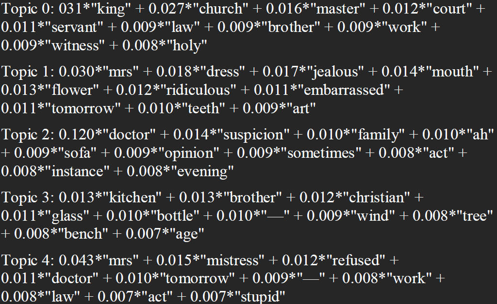
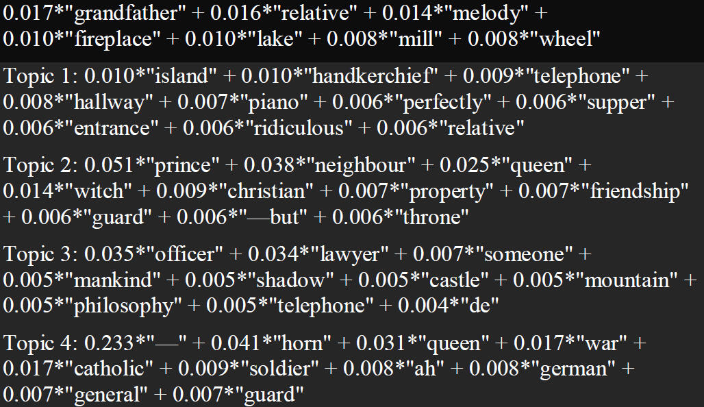
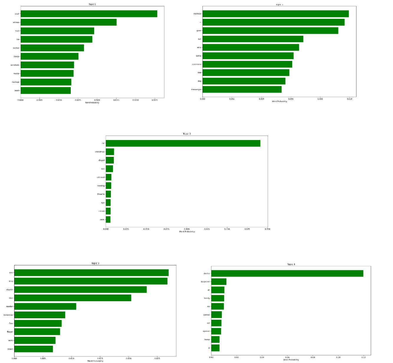
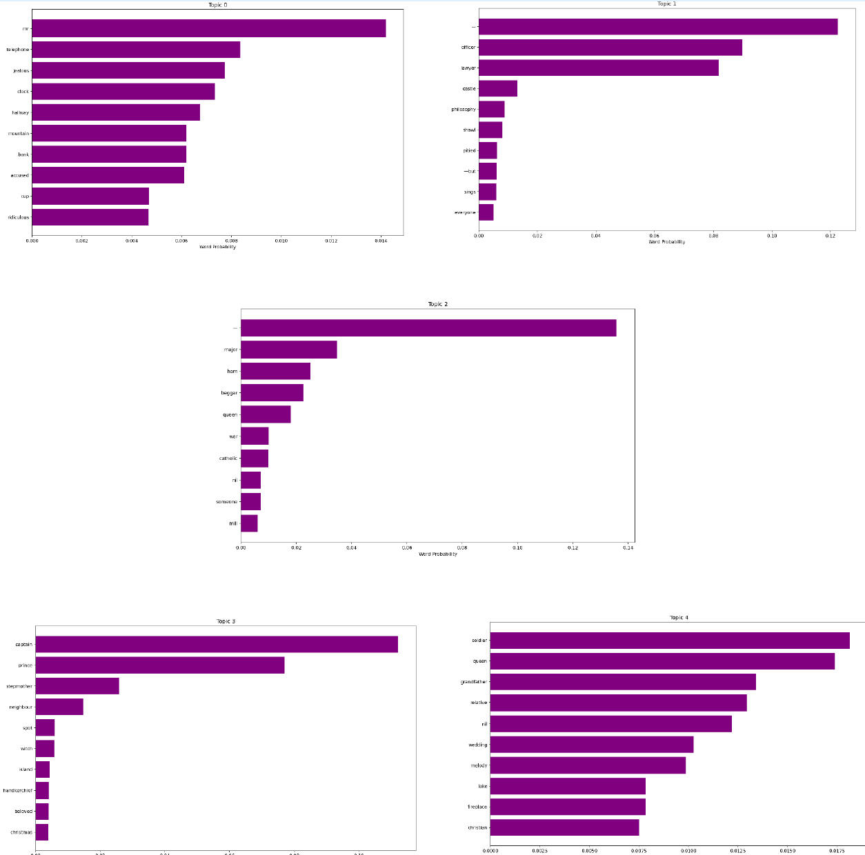
Topic Modeling: Using Python's Gensim library and LDA algorithm, I identified 5 topics per style. Naturalistic plays emphasized family dynamics and social issues (e.g., "marriage," "master"), reflecting 19th-century realism. Expressionist plays focused on existential motifs (e.g., "prince," "witch"), symbolizing inner turmoil and alienation.
To clearly understand the discovered topics, the pyLDAvis library was used to create an interactive visualization that intuitively displays topic distributions and word relationships. This was supplemented with matplotlib bar plots to precisely show the top words and their probabilities for each topic.
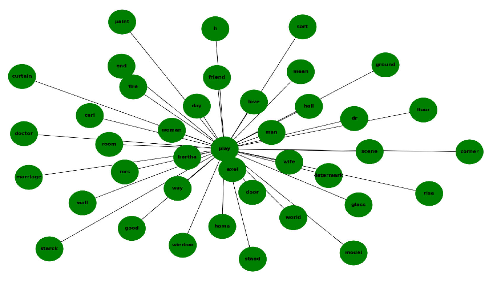
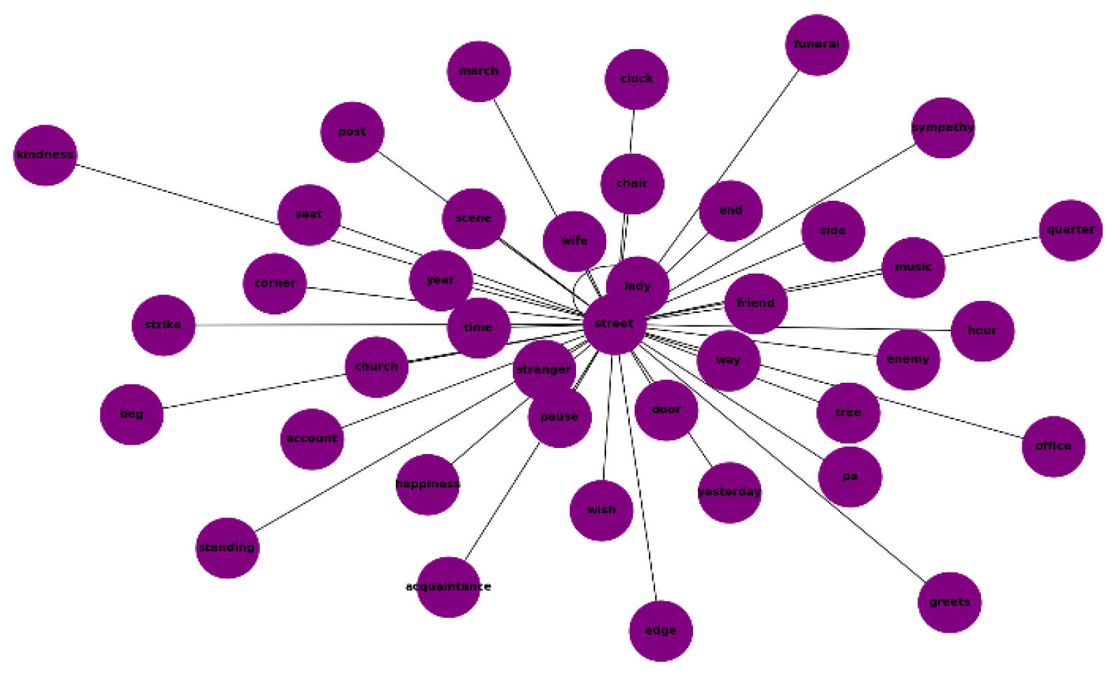
Named Entity Recognition (NER) and Relationships: Analyzed entities (locations, organizations, persons) with normalized frequencies. Expressionist plays showed broader diversity (e.g., more GPE like "Jerusalem"), indicating symbolic exploration.
Selective list of Naturalistic plays entities:
GPE (0.56): 'paris', 'vienna', 'berlin', 'switzerland', 'malmberg', 'germany', 'london'
ORG (6.12): 'willmer house', 'messenger government bureau', 'road', 'ocean', 'house', 'supreme court', 'city chapter'
PERSON (26.90): 'alberg', 'bertha maid', 'hôtel garni', 'abel', 'julia', 'jean', 'sister', 'adolph', 'fiancé', 'husband', 'olga', 'daughter'
Selective list of Expresionist plays entities:
GPE (10.14): 'jerusalem', 'damascus', 'israel', 'france', 'brussels', 'stockholm'
ORG (8.67): 'church committee', 'sin house', 'foe belovèd house', 'pilgrim', 'chapter house', 'catholic fund', 'catholic church'
PERSON (31.23): 'prophet', 'angel', 'god', 'saviour doctor 's', 'mother' 'stranger', 'beggar', 'saviour', 'knight', 'prince', 'jesus'
A co-occurrence analysis was performed to uncover relationships and associations between entities. This data was used to construct network graphs via matplotlib, where entities (like people, locations, or organizations) are nodes, and their frequent joint appearances in the text are weighted edges. The resulting graph highlights key entities and their importance within the narrative by analyzing the centrality of nodes and the density of their connections
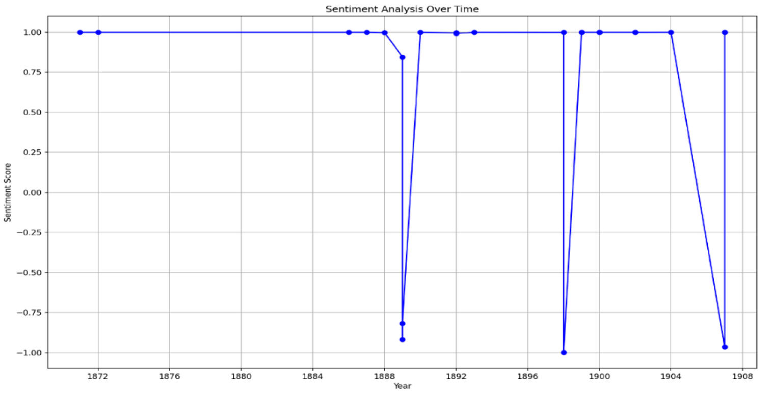
Sentiment Analysis: Applied VADER and TextBlob to gauge emotional tones. Naturalistic plays had a balanced sentiment (score 0.0730), while expressionist ones were more variable (0.0592). Timeline mapping to Strindberg's life events (e.g., Inferno crisis) linked low scores to personal struggles, like in "The Stronger" (post-divorce).
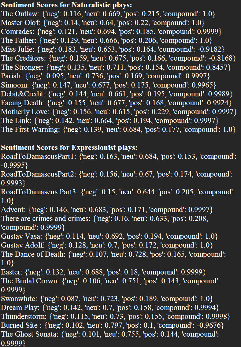
To more comprehensively explore the evolution of emotional dimensions in Strindberg's plays, the sentiment analysis was complemented by a temporal analysis of sentiment scores. This temporal method contextualized and visualized the results by correlating sentiment scores with the years the plays were written, effectively revealing patterns of emotional expression across his entire career.
Accompanying the analysis I created a video timeline visualizing Strindberg’s life and creative journey.
This video visualizes August Strindberg’s life (1849–1912) and creative evolution, blending spatial mapping with cinematic storytelling. Using QGIS, I mapped Strindberg’s residences and publication cities, with green dots marking his locations over time. DaVinci Resolve was used to craft a dynamic timeline, where flashes highlight major play publications and key life events.
This fusion of geographic data and biography transforms archival records into a vivid narrative, showcasing Strindberg’s journey from naturalism to expressionism.
This project merges computational text analysis with visual storytelling, demonstrating how data-driven methods can illuminate the emotional and intellectual evolution of a writer. By combining literary study with digital mapping and video, it bridges humanities research with creative digital visualization.
| Mapping the Impact |
|---|
| The Syrian Refugee Crisis through Data Visualization and Spatial Analysis |
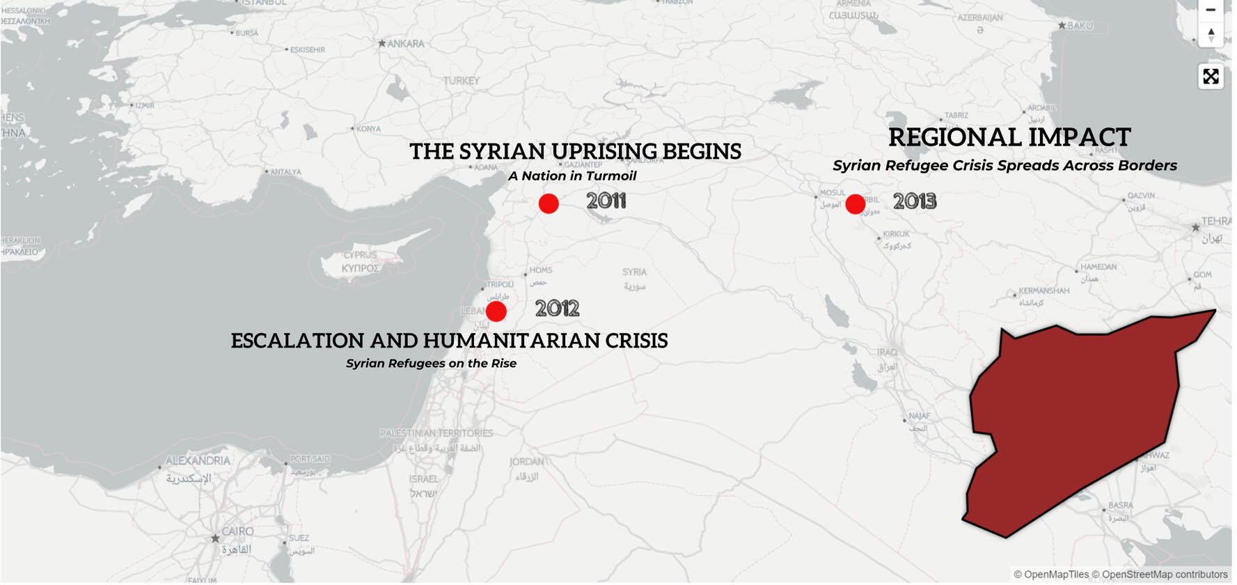
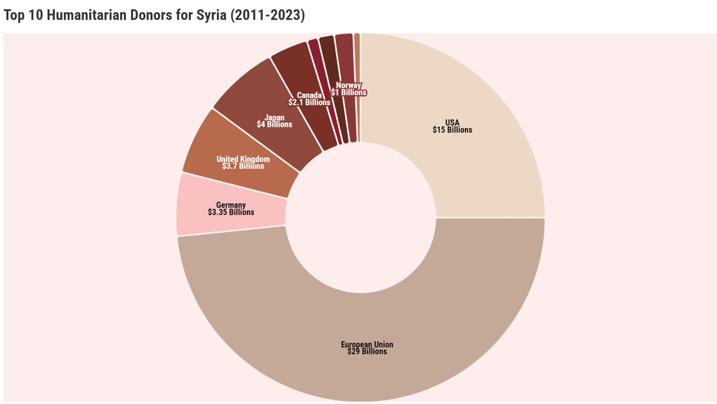
The Syrian civil war, erupting in 2011, displaced over 13 million people, sparking the 21st century’s largest refugee crisis.This project weaves a vivid tapestry of their journeys, using QGIS and Flourish to map and visualize the crisis’s patterns from 2011 to 2023. With data from UNHCR, 3RP, and global reports, I charted migration routes, host countries, and humanitarian needs, transforming raw numbers into a story of human resilience.
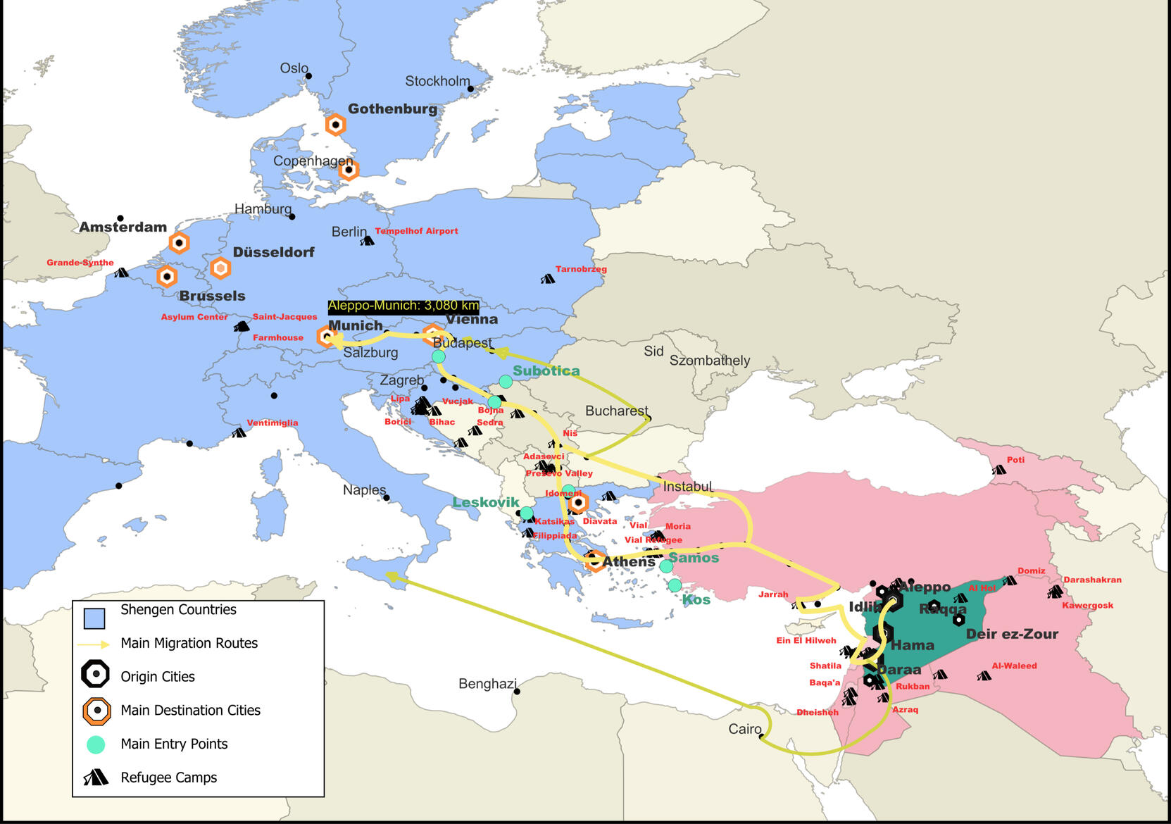
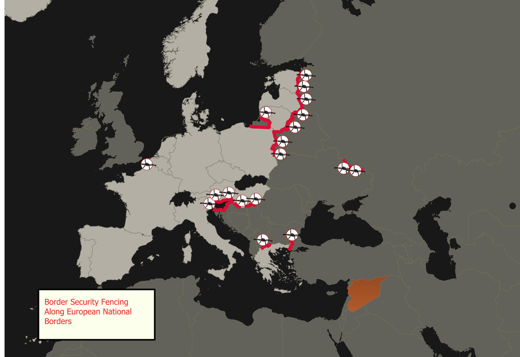
QGIS illuminated the geography of displacement, mapping origin cities, transit routes, and major refugee camps across Europe and the Middle East. Three thematic maps highlight key dimensions: one traces primary migration paths and camps, another spotlights top host nations such as Turkey and Germany, and a third reveals the border fences that have shaped refugee flows.
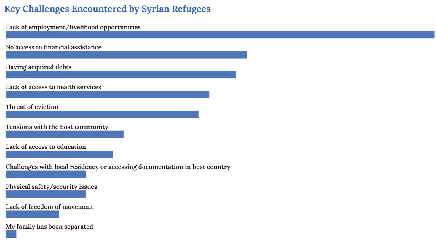
Flourish brought these insights to life through interactive data visualizations: a line graph tracks external and internal displacement, a pie chart displays top humanitarian funders, a bar chart explores refugees’ main challenges, and a population pyramid exposes stark demographics—where children often outnumber adults.
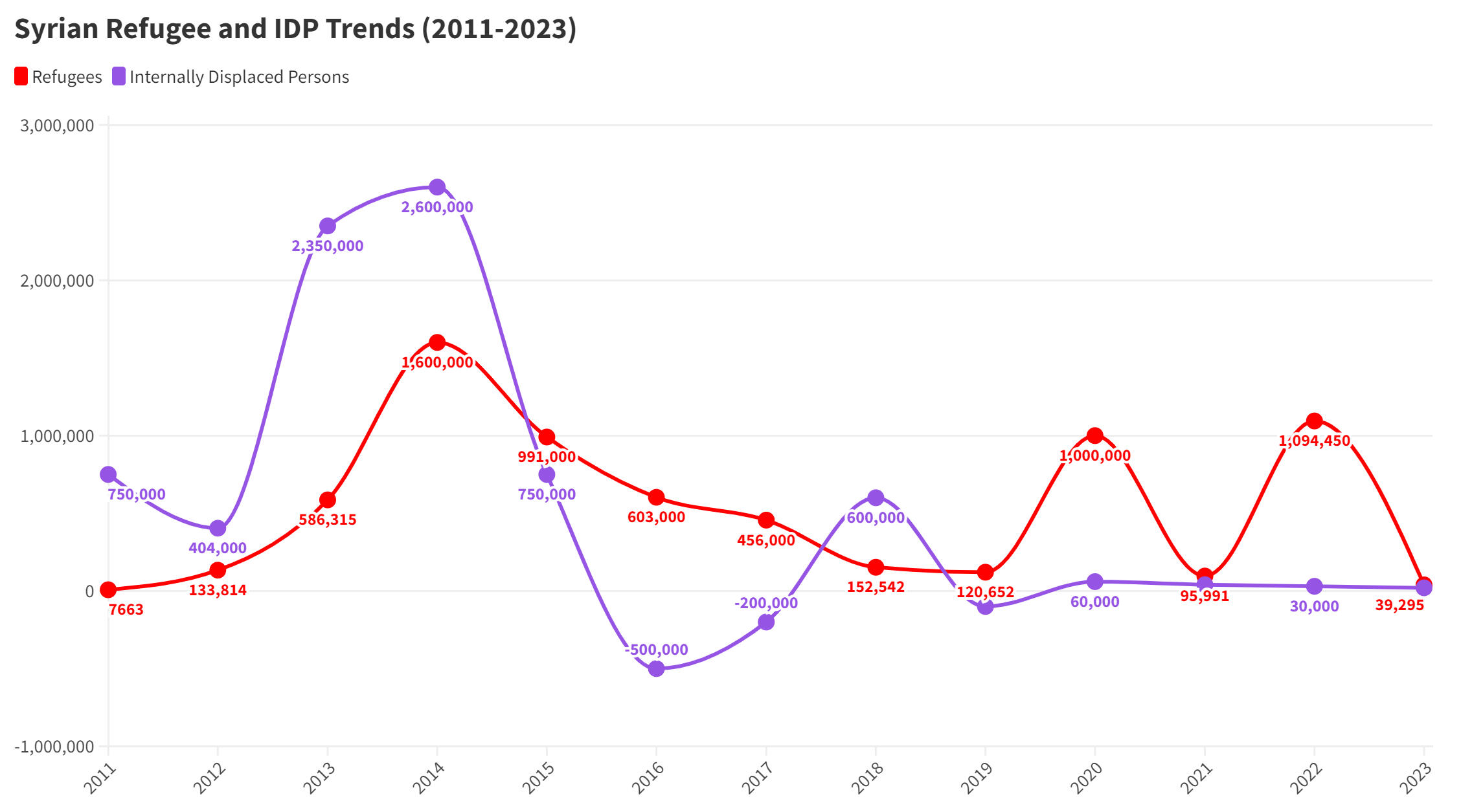
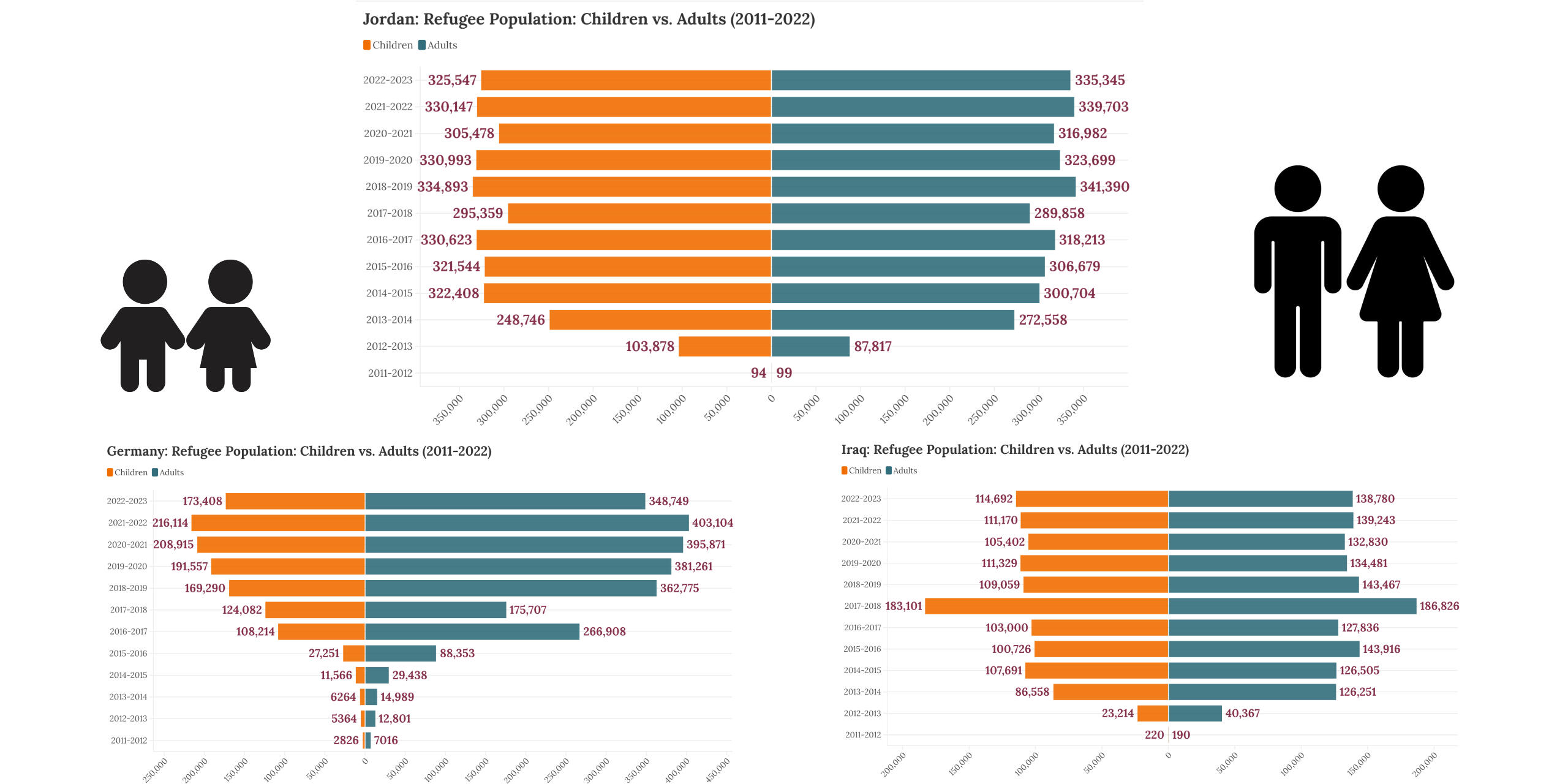
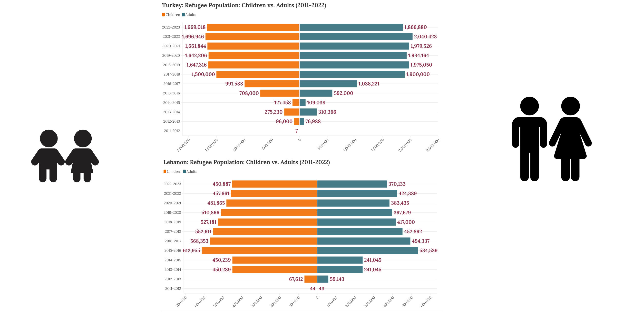
This project blends rigorous data cleaning and geospatial analysis with empathetic storytelling, illuminating the Syrian refugee crisis’s immense scale and profound human toll. Despite fragmented datasets and inconsistent formats, I meticulously cleaned and harmonized data in Excel, ensuring accuracy for QGIS’s detailed spatial mapping and Flourish’s interactive visualizations. By merging these tools, it offers a dual lens—analytical precision to uncover migration patterns, host countries, and demographic trends, alongside a heartfelt narrative that captures the personal journeys behind the numbers.


